October 2020 - June 2021
Bitkub
Redesigning the transaction flows of Thailand's leading cryptocurrency exchange for greater accessibility.
My Role: User Research, Interaction Design, Usability Testing, Visual Design, and Prototyping.
Design Tools: Figma
Collaborators: Non Charoen
Deliverables: Prototype, Wireframe Flows, and High Fidelity Designs.
THE BIG PICTURE
Overview
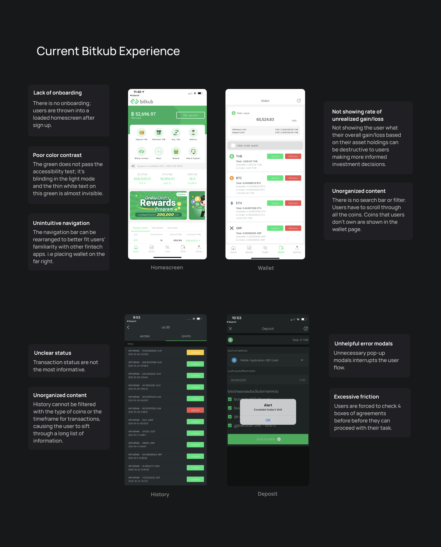
Bitkub is Thailand’s No.1 cryptocurrency exchange. With 4.2 million registered users as of 2022, Bitkub’s mobile app is the first point of interaction with crypto for millions of Thais. The mobile app is functional for early adopters and sophisticated users but is not necessarily delightful for new users.
We embarked on an ambitious journey to make the app more accessible to new users to stay true to our mission to open cryptocurrency up for anyone to buy.
As a result of this project, I established the importance of design to the business and planted a seed for a design team and a design system. Additionally, I demonstrated to the product team how they can perform lean UX research under a tight budget and time constraint.
Design Question
How might we reduce the complexity of making a deposit or withdrawal transaction 📱 ?
How might we make the app more crypto-curious friendly 🤔 ?
The problem
NOT CRYPTO CURIOUS FRIENDLY
The mobile app is functional for crypto-native users and those who are familiar with stock trading apps, but it is not accessible to new users.
COMPLEX FLOWS
The complicated user flow caused users to make transaction mistakes.
LACKS CONSISTENCY
The absence of a design system makes the application lack consistency.
The solution
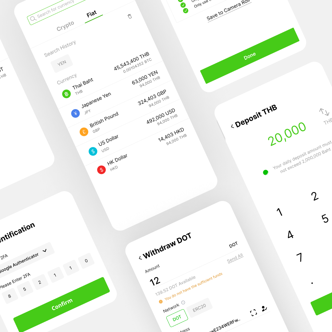
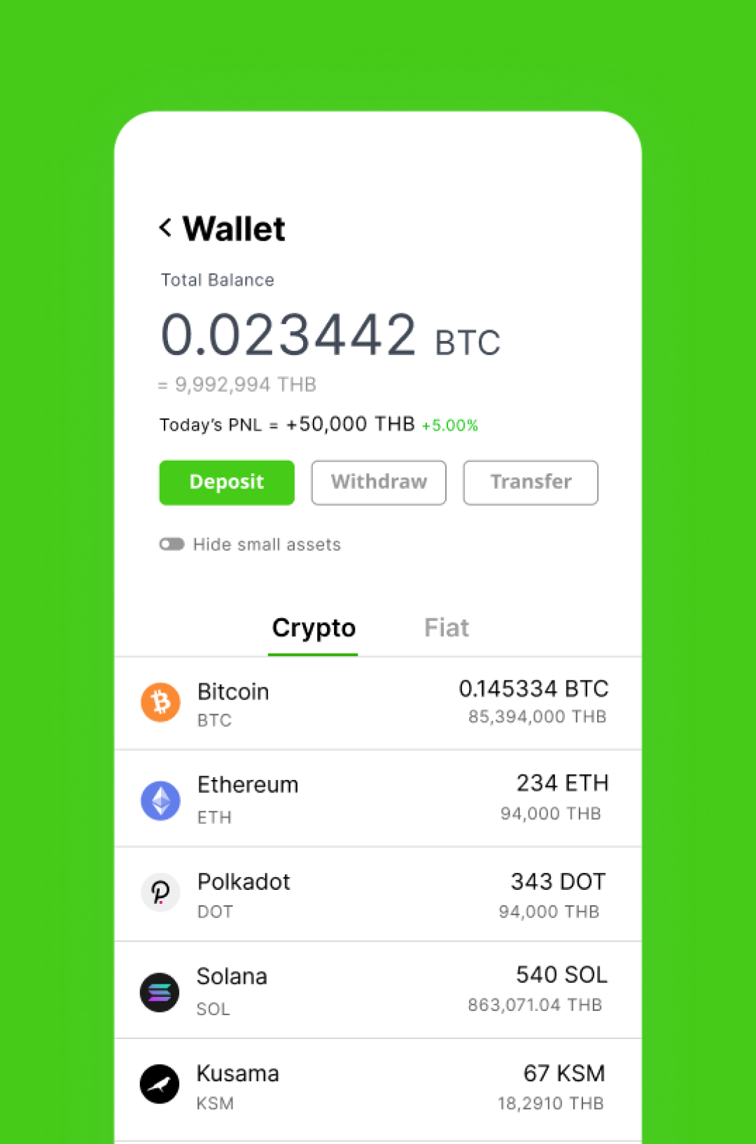
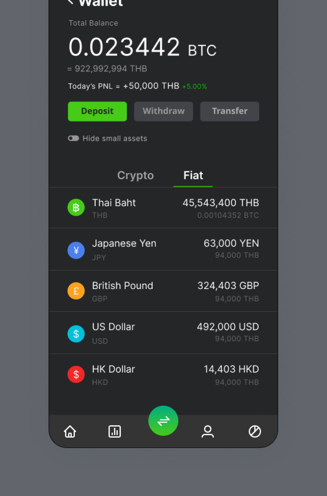
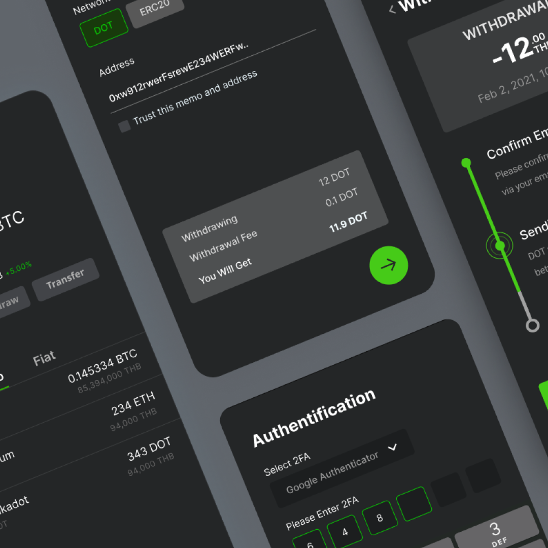
The redesign improves upon the four main transaction flows to solve user pain points. Simplifying the process and providing necessary feedback, saving users from making a mistake with their transactions. We focused on four transaction flows, which are the core pillars of the app: deposit crypto, withdraw crypto, deposit fiat, and withdraw fiat.
THE PROCESS
Design process

01 DISCOVER
Heuristics Analysis
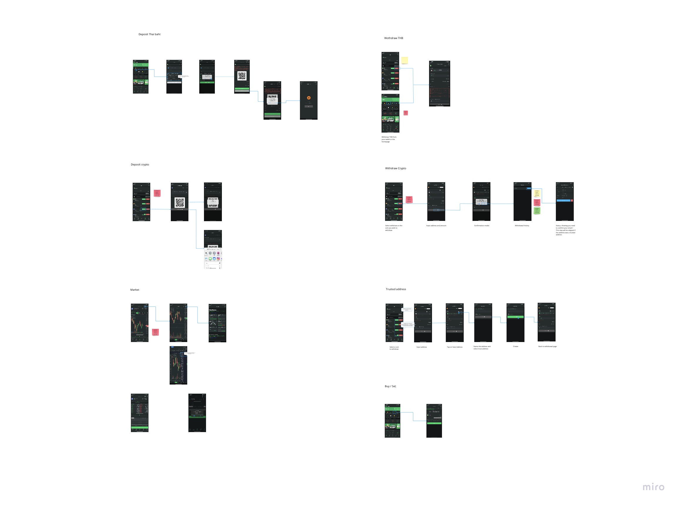
Bitkub lacked a product analytic tool to measure the usability-based KPIs such as task succession rate, task completion rate, and error rate. We conducted in-depth analysis of the current version of the app to understand the functionalities, overall architecture, and identify usability issues and pain points.
O1 DISCOVER
Competitive Analysis
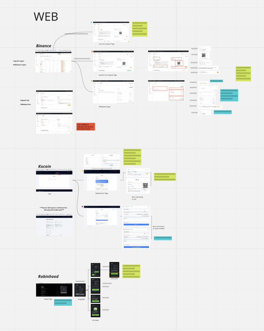
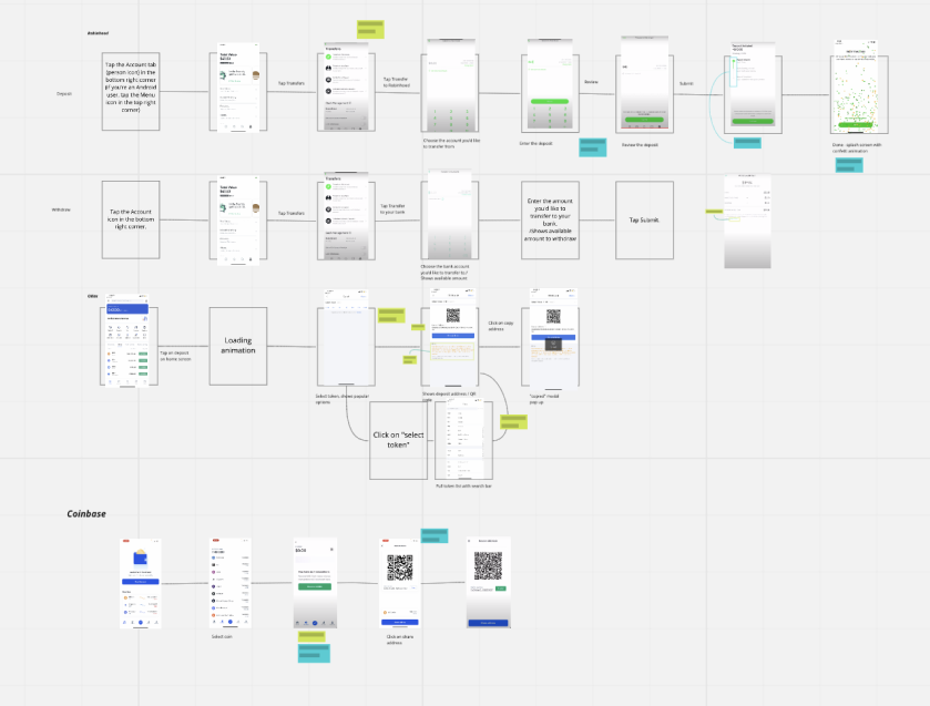
We studied the key flows of other crypto exchanges (withdrawing crypto, withdrawing fiat, deposting crypto, and depositing fiat) to learn the industry's best practices and see how they accomplish similar user goals.
O1 DISCOVER
User Interviews
After performing a hypothesis about what the user pain points are from the usability heuristics, we interviewed users to understand their goals and confirm our hypothesis about their pain points. We interviewed 15 users with varying experiences; the professional crypto traders, the regular wallet users, and crypto curious who aren’t fully into crypto. I asked questions about their experience with Bitkub, motivations and frustrations trading cryptocurrencies, features they value most, issues they face, and how might they improve it.
KEY INSIGHTS
5/5 Crypto-curious users were overwhelmed when they first launched the app.
5/5 Experienced users prefer other crypto exchange apps.
12/15 Users were confused by the jargons and warning modals.
9/15 users have experienced making a transaction error.
02 DEFINE
Personas
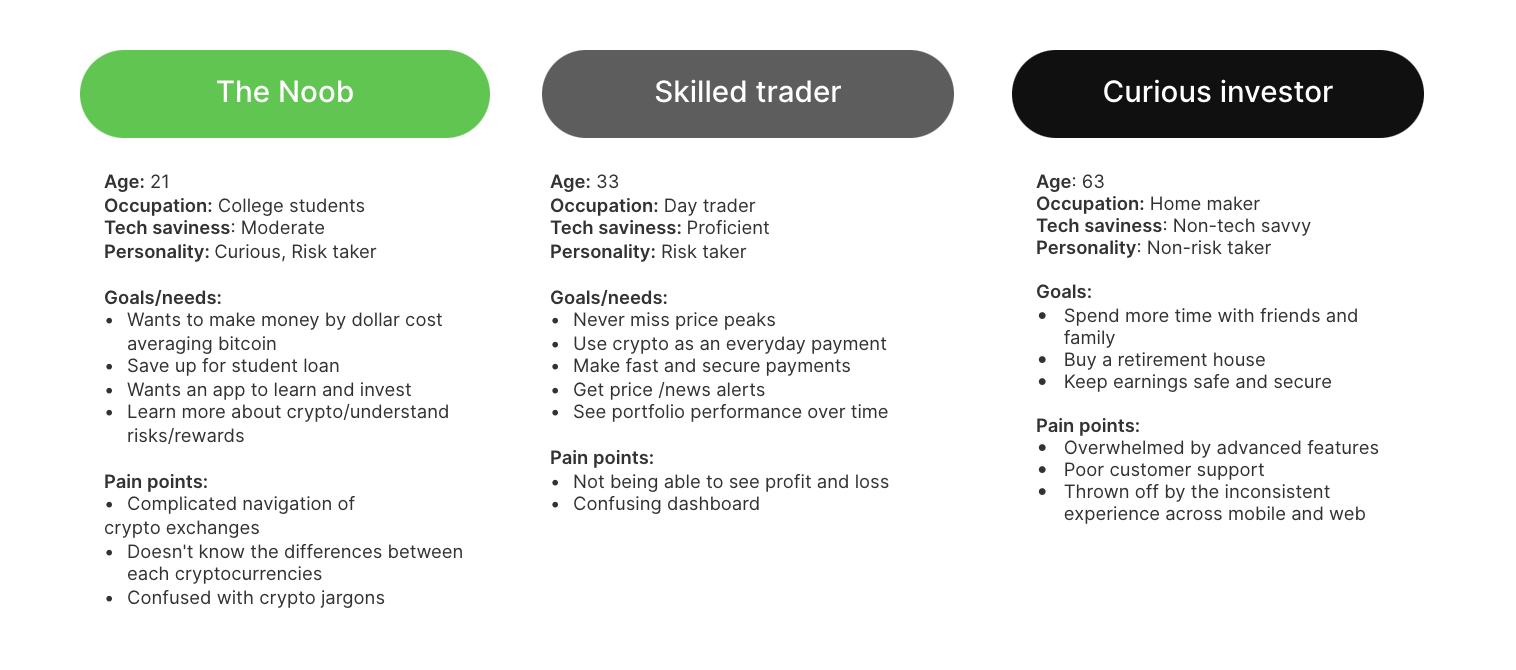
We condensed the insights we found from our research into 3 separate personas to remind us of who we are designing for.
O3 DESIGN
User flow
We mapped out the user flow to get a high-level overview of how the user will move through the product and determine how many screens are needed.

O3 DESIGN
Typography & Colors
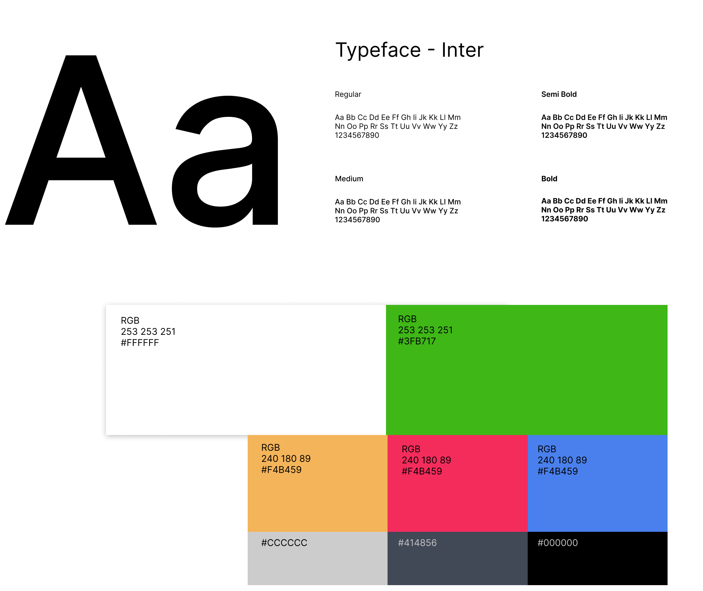
The current colors do not meet the standards for accessibility and contrast. Without a proper design system, Bitkub uses a variety of similar yet inconsistent palettes of greens that vary throughout their product and services, causing user experience to be inconsistent.
We created a vibrant, hand-picked color system with a higher contrast ratio. With our new color palette, we wanted to communicate modernity, simplicity, transparency, and trustworthiness. Sticking to a consistent colour pallet will allow for a more cohesive branding that signals professionalism to the users.
O4 TEST
User Testing
AB TESTING
6 Users who are familiar with the Bitkub app.
6 Users not familiar with Bitkub.
RESULTS
All were able to complete the main user task in each key flow.
All found it simpler than the current app.
2/6 Current users expressed concerns about the new design being too different from the current version.
KEY FEATURE
Progress tracker
Crypto transactions are not instant. User frustrations often comes with not knowing what to expect after a transaction has been initiated.
A progress tracker would allow them to see what's going on, what steps are completed, and what actions they need to take if necessary.
KEY FEATURE
Microinteractions
Showing users the information they need without leaving the modal saves lots of time.
We eliminated the unnecessary pop-up modals and replaced them with default, focused, error, and disabled states (microinteractions) to keep the users informed about what is going on and create a more dynamic & frictionless experience.
KEY FEATURE
Trading password
We had to find a tricky balance between simplicity and friction; transactions should be simple enough, but not so frictionless that users will make mistakes with their money. After reviewing their transaction, users will have to put in a trading password and 2 factor authentication. Users will have the freedom and control to choose between SMS verification or Google authenticator.
NEXT STEPS
Implementation
Based on the feedback from internal testing with the product team, all of them agreed that the new design is modern and the UX solves a lot of Bitkub's current problems. However, the impact of changing a design so drastically would impact the business, as it would disrupt users mental models. One problem that we thought alot about during the design process is how will we implement our design without upsetting our existing customers?
Our solution was to prioritize specific design components for development, gradually implementing the new design and keep the old and new running side by side. Lightweight and gradual changes that users can easily pick up will make the redesign bearable.
REFLECTION