UX/UI Case Study
Drain
A mobile application for breast cancer patients to log and care for their drain.
My Role: User Research, Interaction Design, Usability Testing, Visual Design, and Prototyping.
Design Tools: Figma
Deliverables: Prototype,Wireframe Flows, and High Fidelity Designs
The problem
After surgery a mastectomy treatment or reconstruction surgery, most breast cancer patients will have surgical drains when they go home. Drains play an important role in the healing process; they drain blood or other fluids that can build up at the surgical site.
Drain output and a patient’s post-surgery experience is often overlooked. Currently patients are still doing it with pen and paper, and the process is messy and tedious.
Keeping a drain log and tracking is extremely important for the patient to communicate to the physician because it indicates healing rate and determines when you can have the drains removed. Failing to accurately document the daily outputs may delay the removal of drains and increase the risk of complications.
Design Question
How might we streamline the logging process to ensure a timely recovery for patients 🚀 ?
How might we ease the anxiety of breast cancer patients 🤕 ?
O1 DISCOVER
User Interviews
After learning the prevalence of breast cancer, I reached out to an oncologist and five patients in Thailand who were willing to share more details about their experience with the drains post their surgery. These interviews consisted of 30-minute Zoom and phone calls, where I listened to their stories and guided the discussions to focus on their struggle with the drain log.
The most resonating quotes included the following:
“ There is no uniformity or quality of documentation.”
“I kept losing the drain log and had to make my doctor show it to me everytime how to do it. ”
The most resonating quotes included the following:
“ There is no uniformity or quality of documentation.”
“I kept losing the drain log and had to make my doctor show it to me everytime how to do it. ”
O2 DEFINE
Affinity & User journey mapping
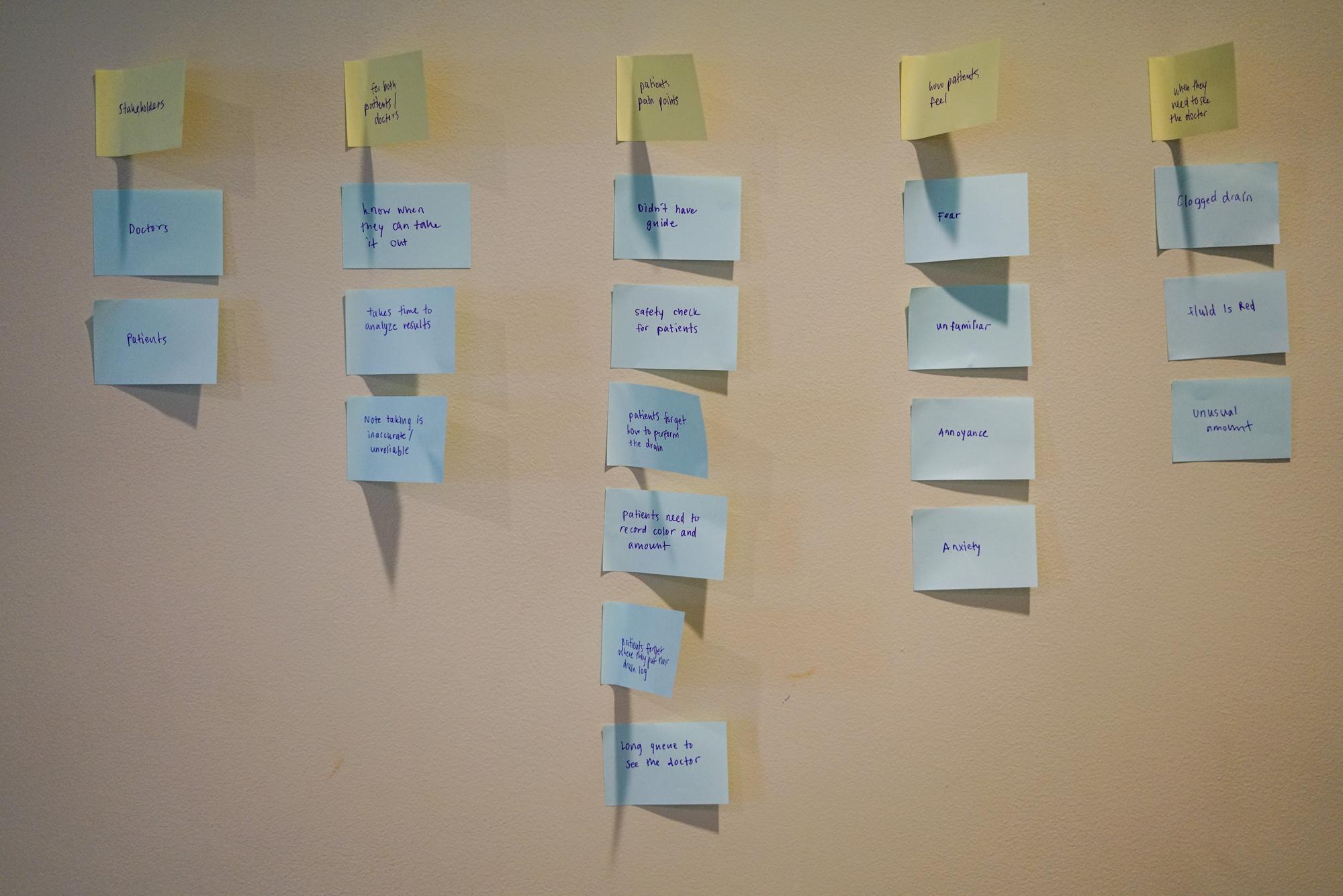
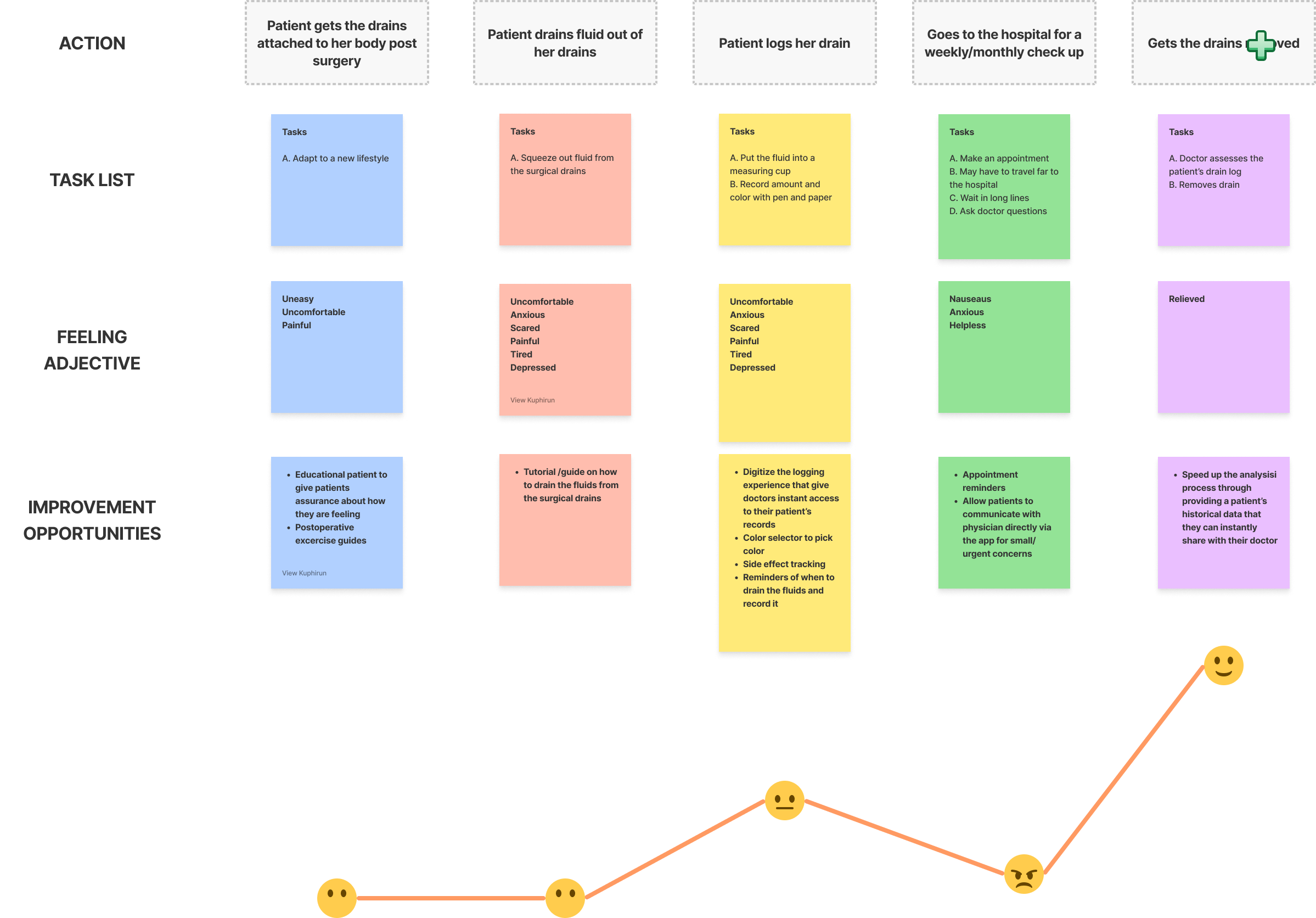
Using post-it notes, I wrote down all the insights I gathered from my research and organized them into categories. This exercise helped me define the problems, figure out which problem is the most important, and develop potential ideas for solutions.
I figured that the most important goal was to simplify the communication process between the doctor and patients, allow patients to get the help they need to lessen their anxiety and make fewer trips to the hospital.
O2 DEFINE
Personas
Synthesizing the understanding from my research and interviews, I created three personas to understand the users’ experience and pin-point pain points and opportunities for design.
O2 DEFINE
Competitive Analysis
I conducted a comeptitor analysis and performed usability heuristics of existing apps to see how the problem is currently being solved and to inform my interface design decisions.
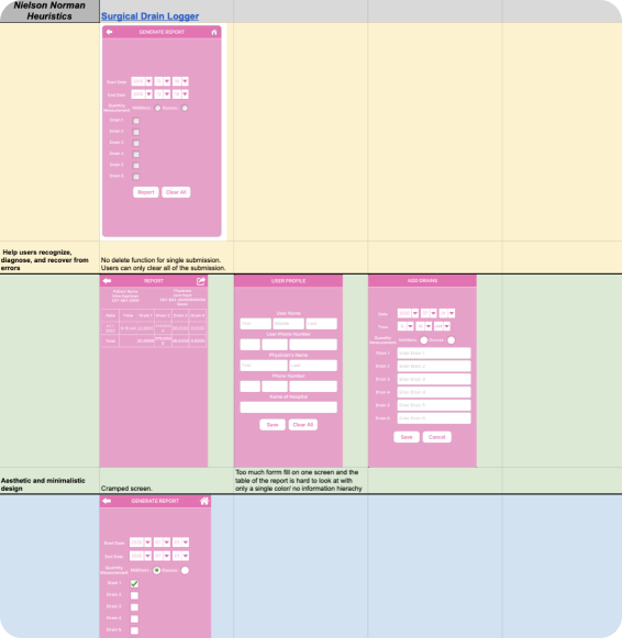
.❌ Cognitive overload
❌ Gendered interface color
❌ No color input
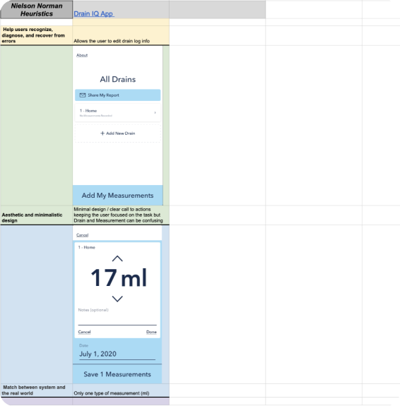
❌ Limited features
❌ No color input
O3 DESIGN
Visual Design
COLOR CHOICE
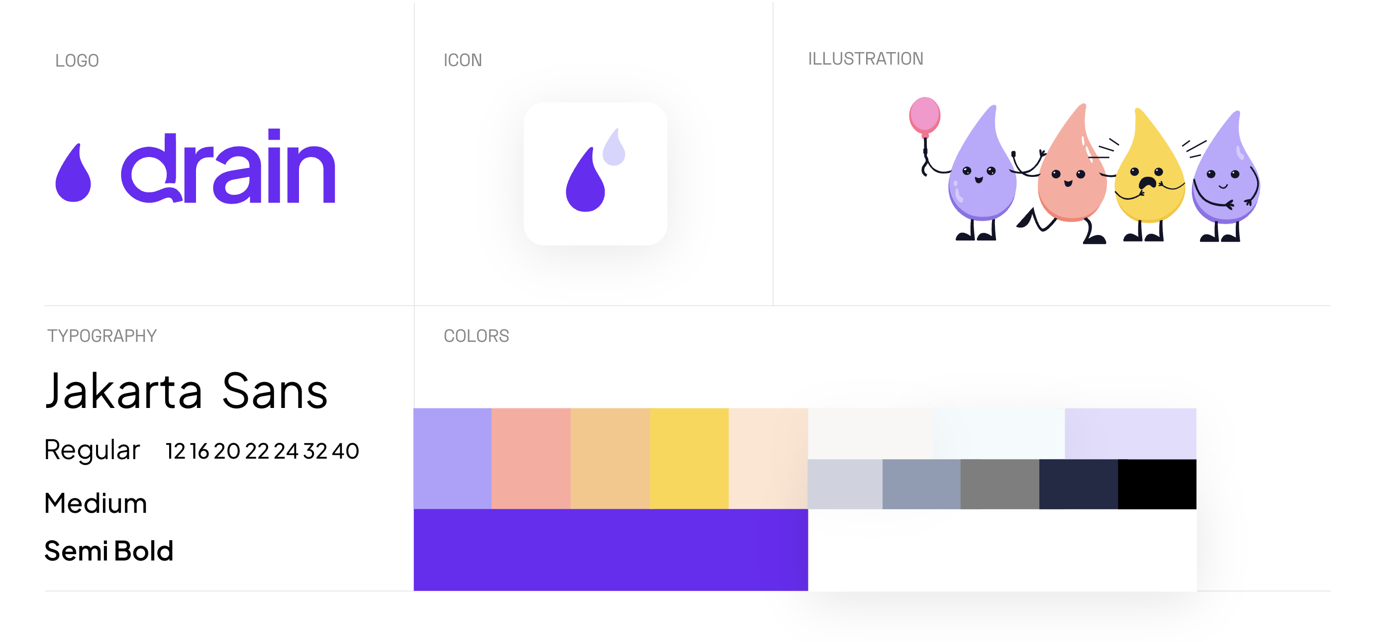
Most breast cancer apps are highly gendered with When considering the style of my interface, I considered the emotions cancer patients must be going through so I decided to settle for cool and calming colors such as pink, purple, and blue. Light blue and grey are used extensively throughout the application to give it that light-weight and relaxed feel.
DELIGHT
For the application to be used with older patients under high stress and anxiety, I made it a priority to make sure that the interface is inviting and easy to understand.
KEY FEATURES
The Log
Patients can easily log the amount of their drains, select a color, and save it with a time stamp.

KEY FEATURES
Reminder
As patients need drain twice a day, they can set reminders to remind them when to drain.

KEY FEATURES
Progress Overview
Patients can see an overview of their progress and get feedback on how they're doing.

KEY FEATURES
Calendar
As patients need drain twice a day, they can set reminders to remind them when to drain.

ITERATE
Design Challenge
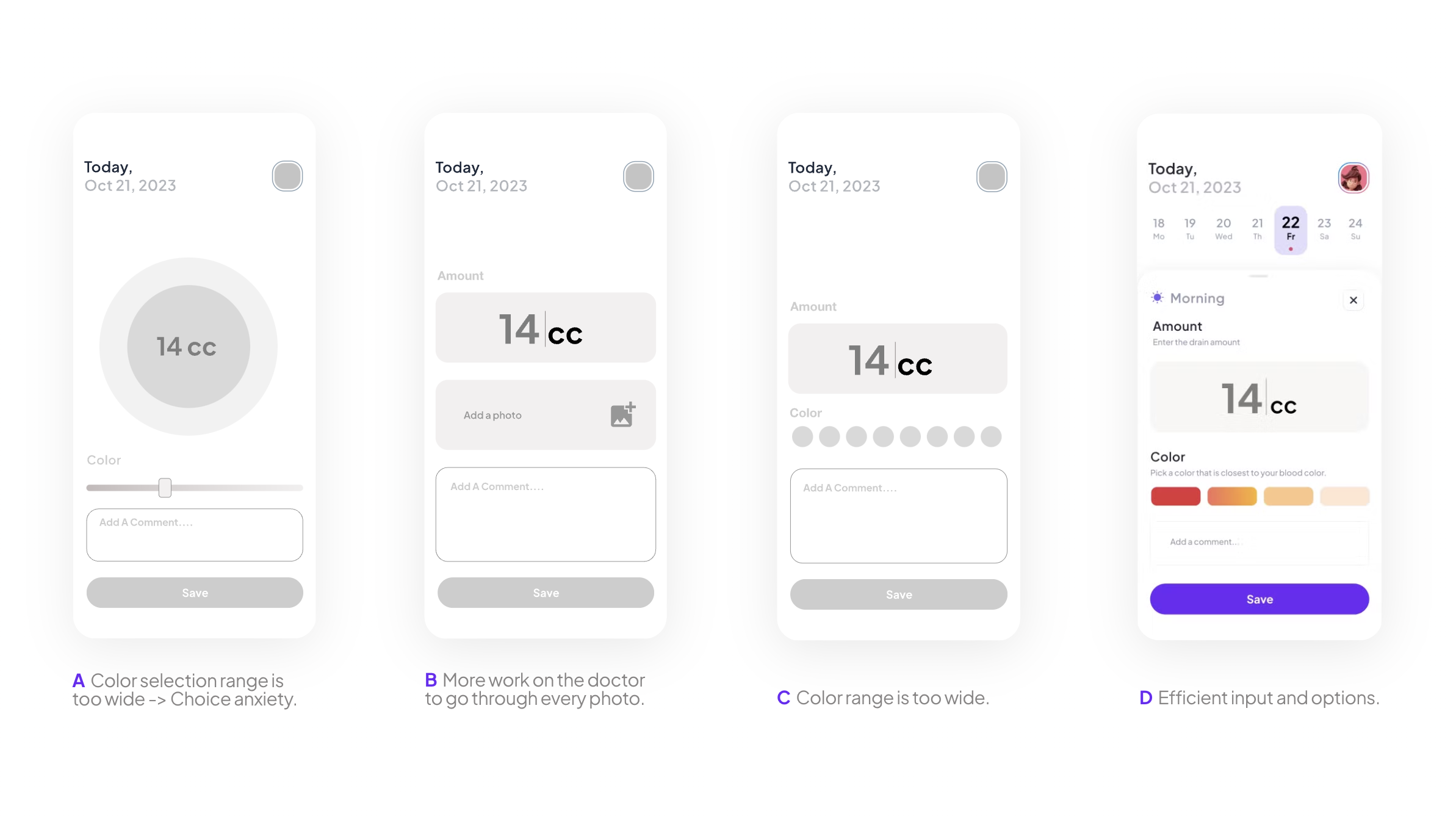
I had 4 design explorations for the drain log and conducted task basked usability and A/B testing of logging in the drain with 5 patients to ensure tha app is accessible to users ith diverse abilities and technological limitations.
Additionally, I gathered feedback from an oncologist about what are the most important colors. Option D emerged as best option with the most effective input and color options.
REFLECTION
What I learned
💗 Empathy As patients may be going through a difficult time. Be sensitive to their emotional state and avoid asking questions that could be triggering or upsetting.
🔄 Iterate, iterate, iterate It is better to show users my designs and iterate early in the process.
NEXT STEPS
If I had more time....
📂 Integration Explore integration into broader healthcare systems for better patient care and data management.
📈 Scale How might I scale it to include other cancer treatments or trans getting a top surgery? / Cater to different stages of treatment and drain types.
👩👩👧👧 Community building Explore how to integrate support groups.
🩸 Physical product design Redesign the measuring cup and drains to truly revolutionize the patients’ experience.